There can be absolutely no doubt in the fact that your main idea, story, or content works as the cornerstone of your slideshow. Still, your choice of the right video color is likewise essential. Unluckily, anyone who is new to creating videos might not find it feasible to use several colors all at once.
One video creation trend has continued to rule the minds and the senses of marketers for a very long time, and that is the use of pastel hues.
This trend is not just working in the video creation industry but even across branding schemes, websites, social media, interior decoration, and fashion.
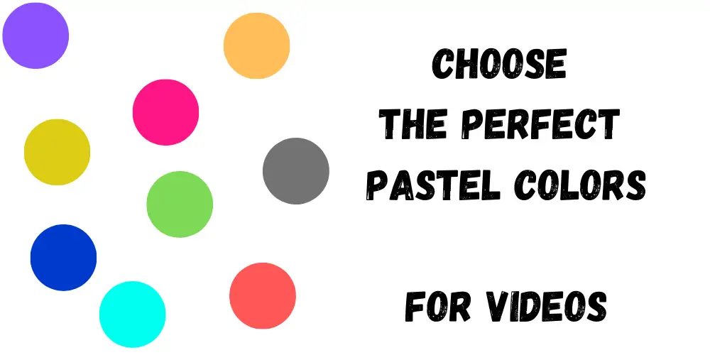
But, do you know what defines this color exactly. A pastel is any color having just sufficient white blended into it to make it appear soft and pale while maintaining its flamboyant personality. Common colors blended in are light azure, pink, whimsy yellow, and creamy mint.
Here are some ideas on choosing the perfect pastels for videos to make them appear more charismatic and alluring:
1. The Monochromatic Pastel
Of course, the pastel color palette is the most harmonious one, but at the same time, it is also quite limiting. Color harmony is something that is guaranteed when going for pastels.
Red chalk or sanguine has been very popular, but all the other neutral colors and even gray work. This combination might not be the most exciting one, but it will not be criticized as well.
Read also – Viddyoze 3.0 review
2. Considering the Background Is Important When trying to Choose Pastels for Videos
The background you have chosen for the video serves as the foundation of the piece. Hence, it should not be overlooked. The background is something on which the success of your video depends.
Of course, there are no rules as to which pastels are the best for different backgrounds. Nevertheless, if you are on the lookout for creating contrast, it would be better for you to choose a background that is opposite in color from the pastel hues you have chosen.
However, for creating harmony, go for background colors that match the pastels of your choice.
3. Layer the Colors
Layering colors means either covering them entirely or allowing parts of the colors to show through. This often results in color complexity making the pastels appear more convincing and natural.
Naturally, when the pastels are layered, they blend and add interest and variety to work. Nevertheless, do not expect one layer of the pastel to do the trick for you. Try layering several applications of these colors to get a more natural and finished appearance.
4. Mix Colors
Well, the color blending technique has just been detailed. Color layering results in mixing pastels, and this is important for all kinds of colored videos. Pastels can easily be mixed simply by layering the colors on top of one another.
Instead of going for that specifically designed green, it would work for you to mix it with blues and yellows. You even have the option of deepening the color if you find the mixed green not very suitable.
5. Combine Blended and Unblended Applications
If you do not know, pastels have this amazing ability to produce different varieties of marks. It is this attribute that you need to exploit. Of course, you can blend in different pastels for creating a smooth video. This is amazing as well, but make sure there is a perfect balance.
The wise idea is to combine the blended and unblended applications. This can help in producing strong and attractive bursts of contrast and color while making the subjects of the video appear closer to the viewers.
6. Go for the Cool or Warm Pastel Palette
When working with pastels, you have the flexibility of expanding the limited palette to dual colors. For example, the perfect blend of orange and black is called the cool/warm palette. This is because black is cool while orange is warm.
Such palettes go a long way in creating an effective sense of shadow and light in videos. For those who want to make this pastel contrast even more alluring and effective, swapping the black color with blue will work.
If you think that this two-color pastel palette will be completely trouble-free regarding color harmony, you are wrong. Remember, orange and blue are complements, which means that they might be jarring if they are used intensely.
7. Classic Pastels for Packaging and Branding Videos
If you are making a packaging and branding video, you must surely go for classic pastels like sky blue, soft mint, and pink. These three colors, when blended with white and black, make the best combination.
Of course, different materials can also be used in these pastel colors for creating a subdued and exclusive design. Your pastel branding plan can also include colors like creamy grays and yellows. The incorporation of these colors helps in making memorable and strong videos.
8. Neutral Pastels for Interior Decoration Videos
Certain neutral pastels have very small amounts of white blended in. Thus, they are not considered pastels at all. However, these colors duly maintain their pastel features and are more gorgeous and vibrant at the same time.
Videos made using neutral pastels with backgrounds also in pastel can help with the clean display of comfort and luxury important in interior decoration videos. And yes, you can even go for the black details as they bring it all together.
Conclusion
You can craft the perfect video marketing campaign by going for pastel colors. But make sure that you are using them in the right way. Once you find the right color inspiration for your video, it is time to finalize the whole video marketing campaign.
Selecting the perfect imagery and customizing it in the right way will help you in creating effective and instant visuals. Use pastel as the color inspiration for your next video promotion campaign and bring it to life. Abide by the tips mentioned above and make a stunning video!